The starting point
The CRMs that Argentine small businesses use share one problem: they show everything, they action little. The salesperson logs in, sees a dashboard with 40 widgets, and goes back to WhatsApp to actually work.
I wanted to design the opposite. A product that tells you, day one, without you having to think about it:
"Today call these 3. Aliaga's quote expired yesterday. Sofía has capacity — hand her Diego's cold leads."
This is what the owner of a small business asks their salesperson every Monday. What was missing was a product that said it first.
The dashboard isn't a dashboard
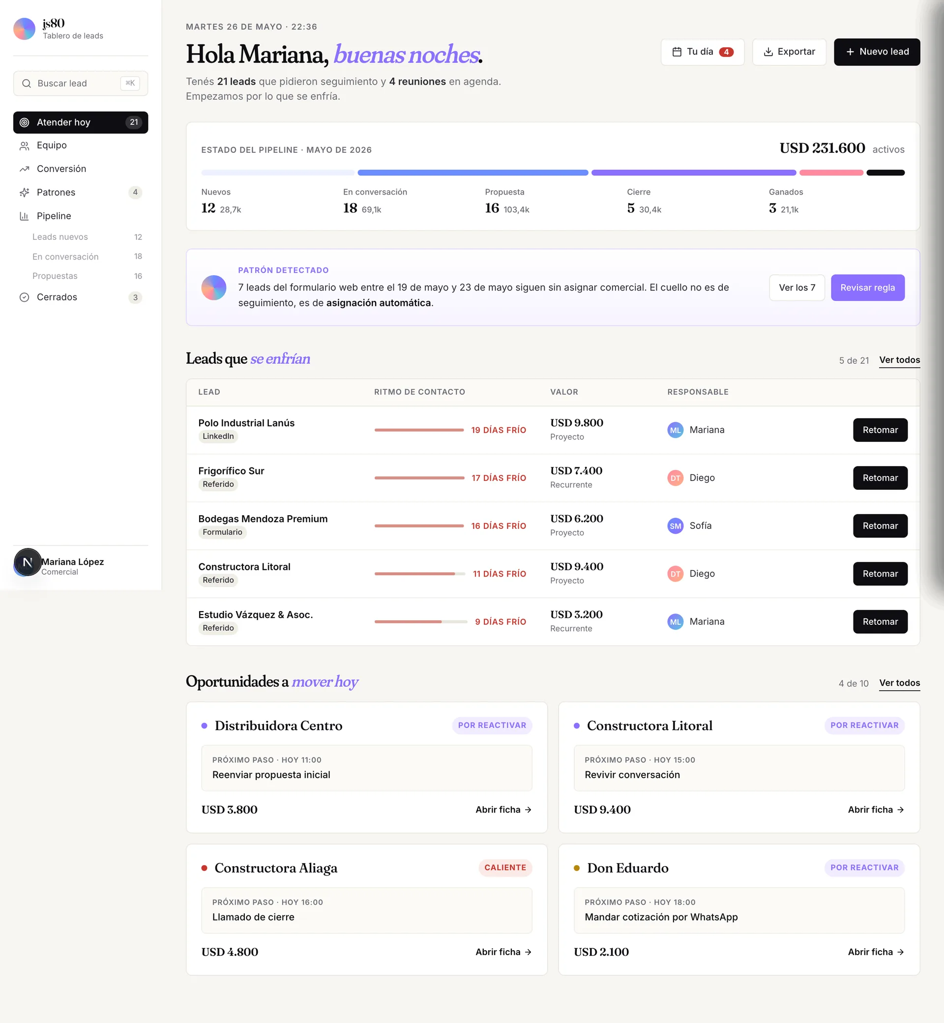
The home has an intentional structure:
- Pipeline state — active USD distributed across stages
- Detected pattern — the system tells you what's happening; it doesn't wait for you to find out
- Cooling leads — the ones losing temperature, sorted by urgency
- Opportunities to move today — the next steps committed with a time
No charts up front. No big KPIs. Those are one click away. The home takes care of what to do now.
The greeting changes with the time of day — "Hi Mariana, good evening" — because the product talks to you, it doesn't report to you.
Honest intelligence
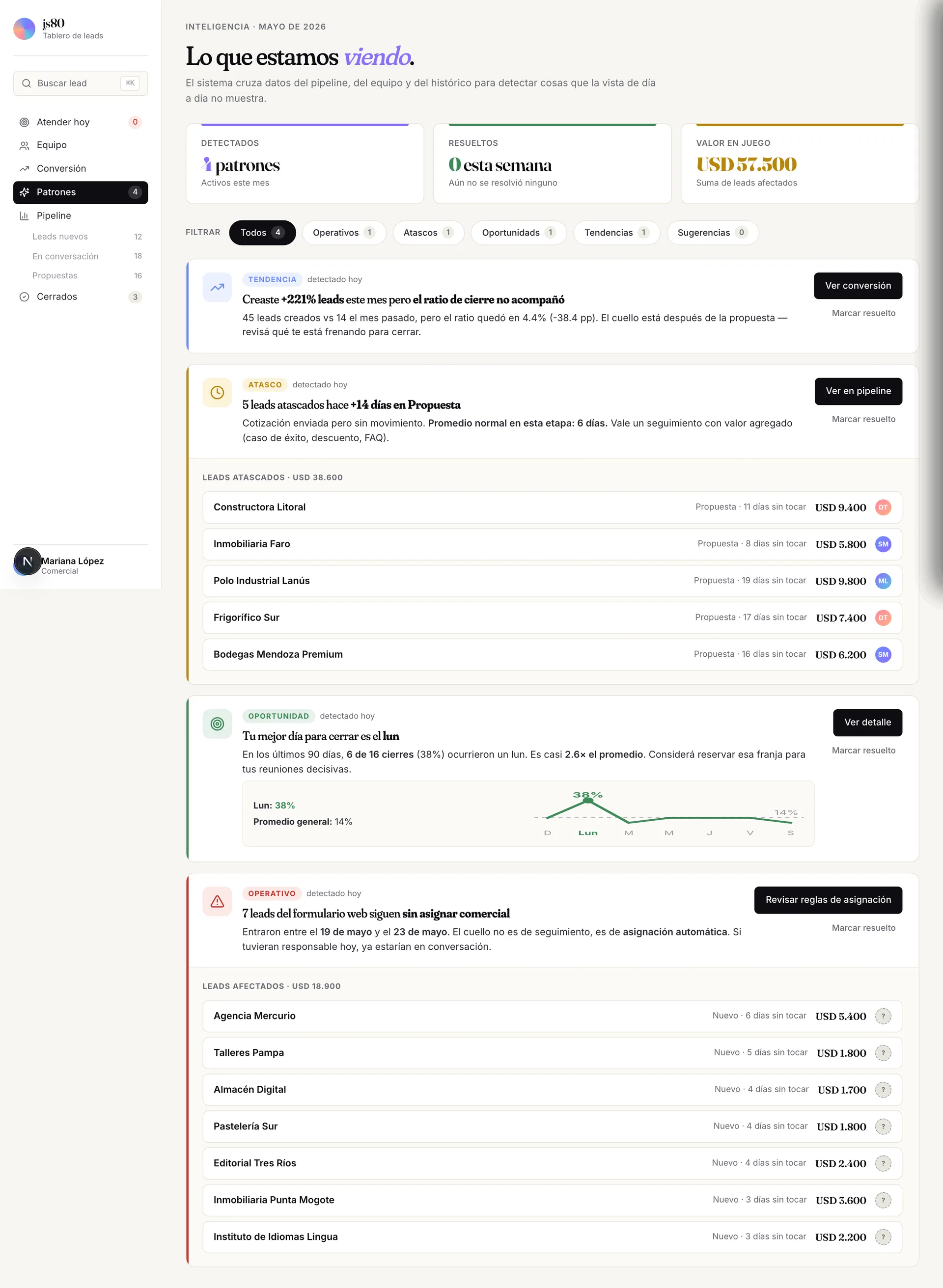
Five detectors that cross the pipeline, the team and the historical record:
| Type | What it detects |
|---|---|
| Operational | Web-form leads with no salesperson assigned |
| Stuck | Leads >14 days without movement in a stage |
| Opportunity | Concentration of wins on a given day or time slot |
| Trend | Imbalance between leads created vs closed |
| Suggestion | Workload imbalance across the team |
Behind the "AI" label there are deterministic SQL queries. I did it that way on purpose: the "AI" most CRMs sell is exactly that. Being honest about it was a product decision, not a technical one.
-- "Stuck" detector (simplified)
SELECT l.*
FROM leads l
JOIN last_change lc ON lc.lead_id = l.id
WHERE l.stage = 'proposal'
  AND lc.last_date < now() - interval '14 days';
Each pattern can be marked as resolved, but it stays in the history — that protects the user from "losing" an insight if they close it by mistake, and lets the system learn which patterns actually help.
The lead detail
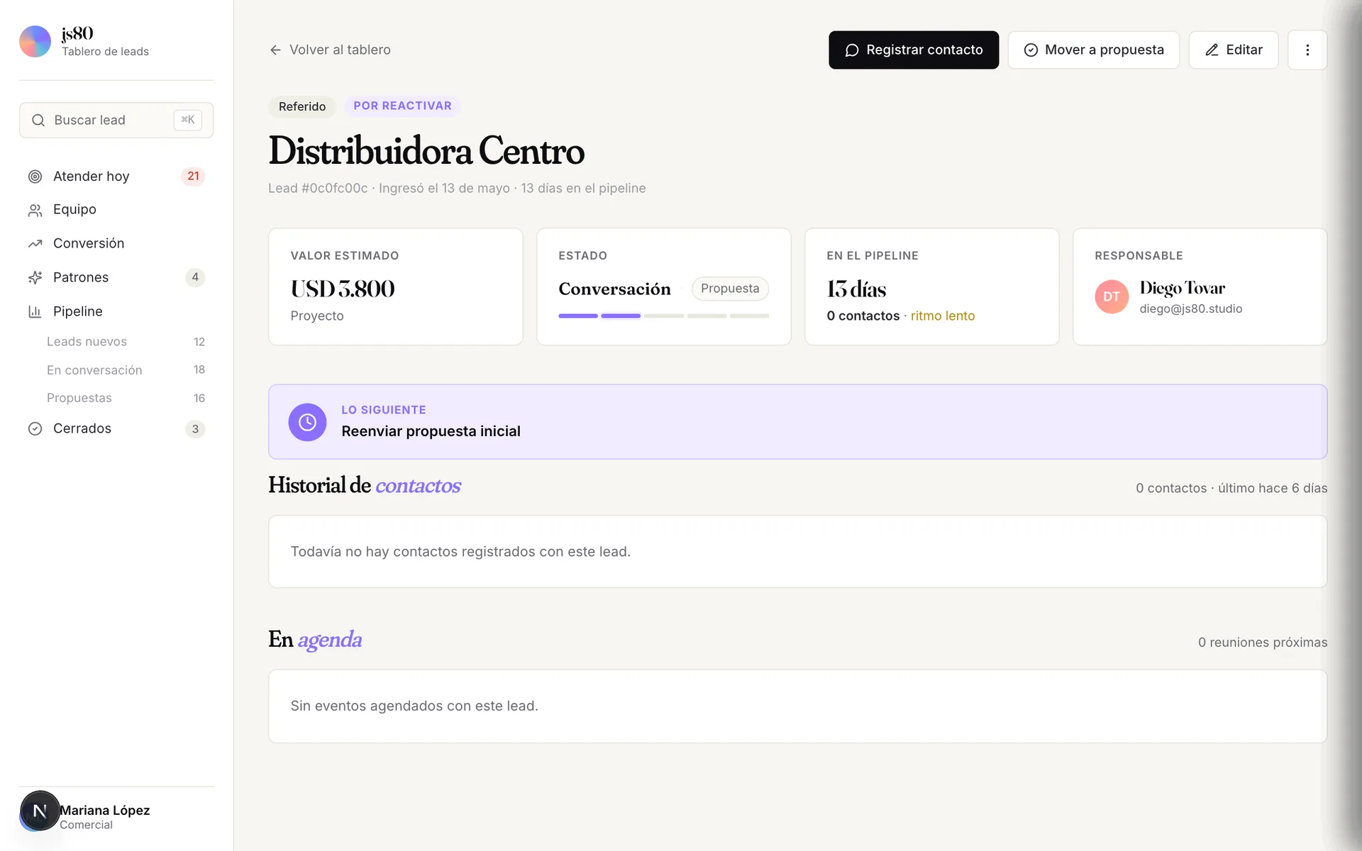
Each lead is a full page with four status cards (value, stage, days in pipeline, owner), a prominent what's next block, the contact history and the schedule.
Three primary actions on top: Log contact (the most frequent, in black), Move to proposal, Edit. The "…" menu keeps the secondary ones.
The progress bar under the current stage shows where it is and which stage you can move it to. A small but important decision: the user always sees the full path, not just the box they're standing in.
The pipeline kanban
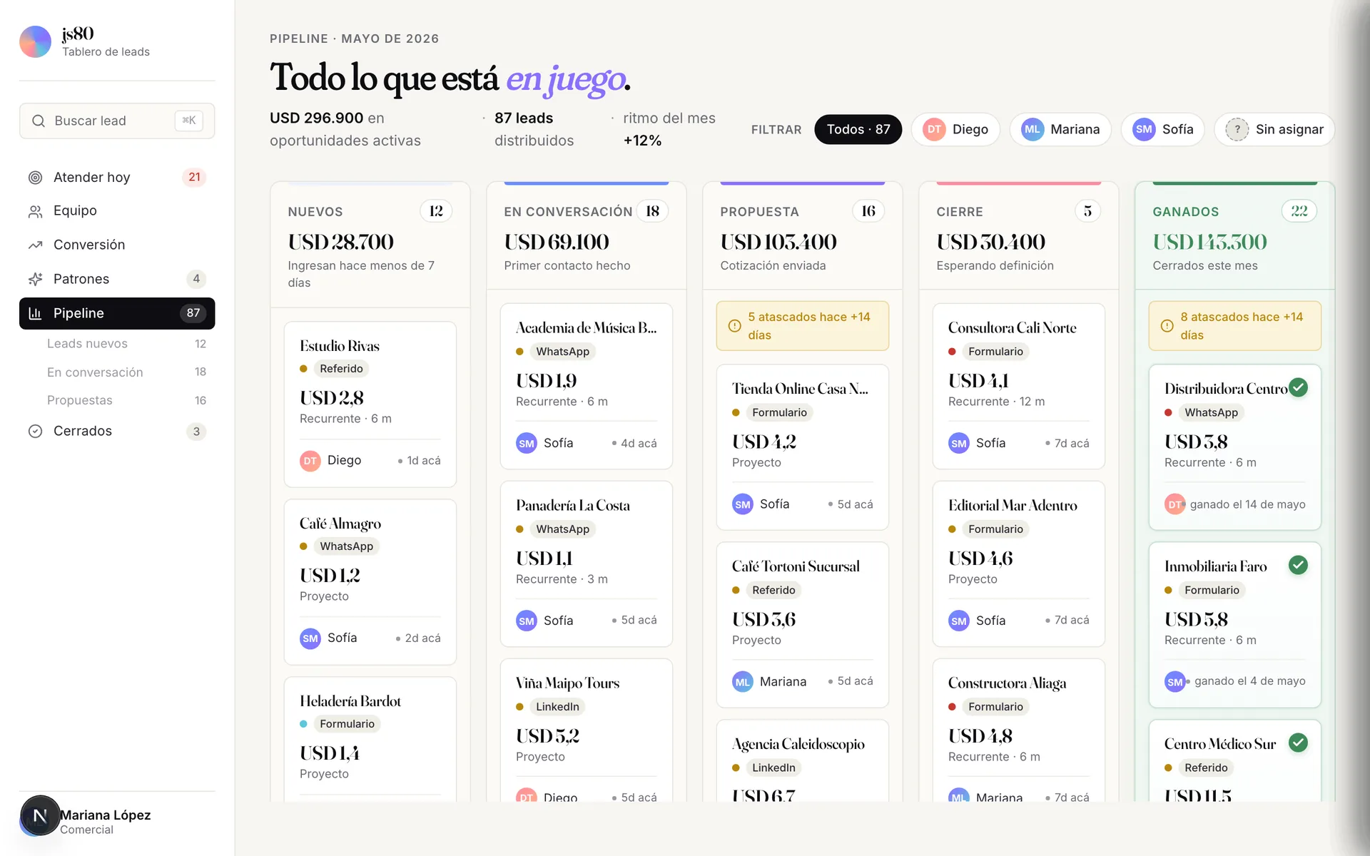
Drag & drop with @dnd-kit, spring animations with framer-motion. Five columns, each with its own color accent on the top bar.
The detail I like most: stuck warnings appear as yellow cards inside the column, mixed with the rest. The insight lives where the work is, not in a separate tab.
Conversion and closed
Two sides of the same month, with two different audiences.
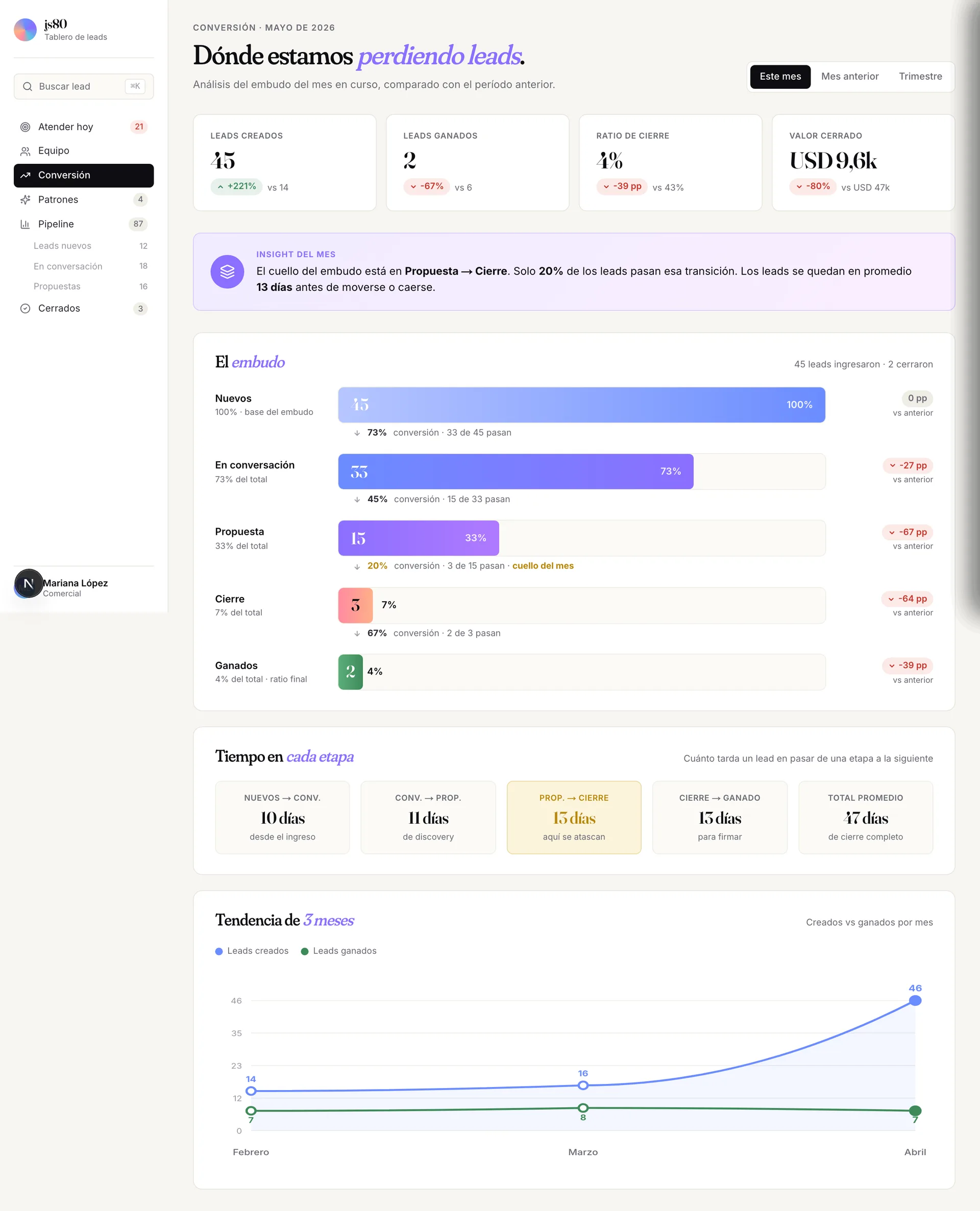
The title of /conversion reads "Where we're losing leads" — not "Conversion funnel". Framing matters: the owner opens this screen looking for a problem, not contemplating a metric.
An insight of the month in the header. Funnel with conversion rates between stages. Time per stage with the bottleneck highlighted. A 3-month trend line.
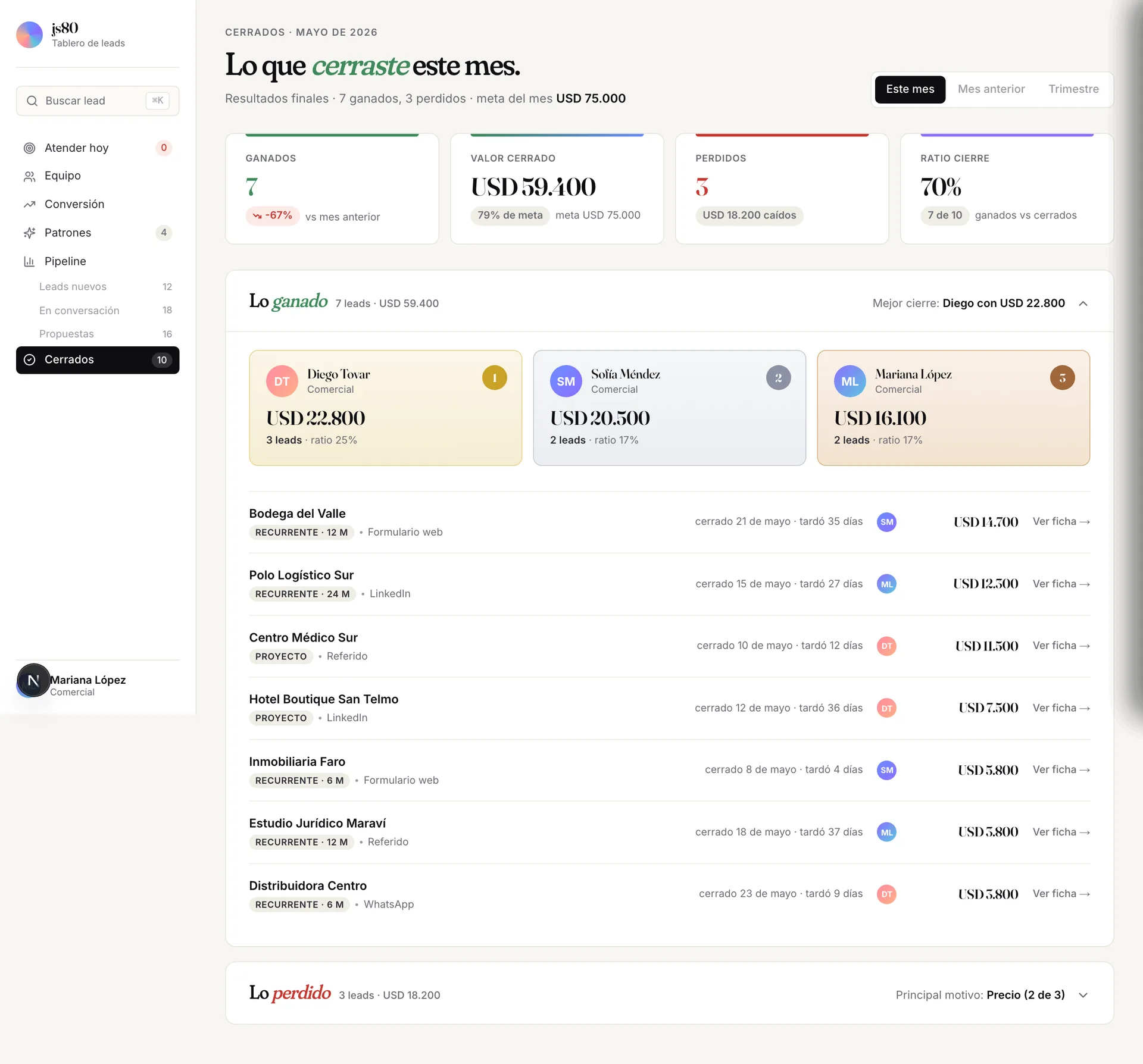
/closed is the counterpart: the tangible outcome. Salesperson ranking with gold, silver and bronze. Subtle gamification works in sales, and the ranking is calculated by closed value, not by ratio — which protects the rep who closes few but big.
The visual system
Four decisions kept consistent across the product:
- One display typeface in italic for one keyword per title. Watching. Closed. Losing. At stake. Each screen has its verb.
- Three semantic colors (red, yellow, green) and four brand colors (blue, violet, teal, coral). Nothing else.
- One hero element per screen. If there's a nucleus, nothing else competes.
- Rioplatense voice across the UI. "Tenés 21 leads que pidieron seguimiento". No jargon. A small business in Bahía Blanca has to feel the product is talking to them, not to a San Francisco startup.
Mobile-first without being mobile-only
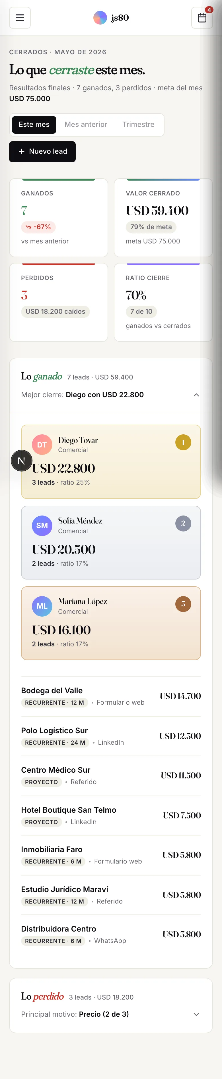
The 7 main screens have a full mobile redesign. It's not automatic responsive: KPIs rearrange to 2×2, accordions collapse differently, tables compact down to only what matters.
On mobile, data loses columns (owner, exact date) and only what matters on a small screen stays. Density changes, hierarchy doesn't.
What I left out (on purpose)
Three things a "complete" CRM would have and this one doesn't:
- Email and WhatsApp integrated: the product pre-fills and opens your client, but it doesn't send. Integrating Meta Cloud API plus Resend adds two weeks of work and 60% of the real bugs.
- Separate owner dashboard: today everyone sees the same view. When it scales beyond five people, a toggle will be needed. Not today.
- PDF reports: I have the system, I didn't wire it because the product doesn't need it yet.
Saying "not this" is as much part of design as saying "this".
How it's built
Small, opinionated stack, no over-engineering: Next.js 15 with App Router, Supabase (Postgres with RLS), Tailwind v4 with design tokens, framer-motion and @dnd-kit, deploy on Vercel with a nightly cron that resets the seed at 03:00 ART.
The product's 42 screens and components were built in roughly five days by splitting the work across three Claude instances: one in chat for design and product decisions, another in VS Code for implementation, and another in Chrome for post-deploy audits.
That split — design, build, audit — lets one person move at the pace of a team of four.